
Digital Brand & Commerce · Web Platform · 2025
Zambic
Establishing an authoritative digital identity for scalable growth.
Zambic
Digital Brand & Commerce
2025
Brand Strategy · Brand Identity · UI/UX · Web Development
Developed a modern digital identity and web system designed to establish clear brand positioning and streamline customer engagement.
Shaping a cohesive digital presence for a growing brand.
Zambic engaged BRNND to establish a refined brand identity and modern digital experience.
The project focused on clarifying the core brand offering, designing an intuitive information architecture, and establishing a consistent design system that supports long-term growth.
BRNND developed the brand visual language, typographic hierarchy, responsive interface layouts, and web implementation.
Building clarity and credibility in a competitive landscape.
Emerging digital brands often struggle to articulate their value proposition across fragmented customer touchpoints.
Without a disciplined design system, inconsistent messaging and interface clutter create friction and weaken brand perception.
"The opportunity was to build a clean, cohesive digital system that communicates confidence, simplifies navigation, and provides a scalable foundation for expansion."
Structured design thinking applied across identity and interface.
Brand Clarity
Distilled the core positioning to ensure value is understood within seconds of landing on the site.
Design System
Created modular UI components, consistent spacing tokens, and purposeful typographic hierarchy.
User Experience
Simplified user pathways to minimize unnecessary clicks between initial interest and core engagement.
Performance & Scalability
Engineered lightweight, responsive code ensuring rapid load times and seamless cross-device performance.
The Zambic visual system: Clean typography, deliberate structure.
A disciplined palette of dark graphite, crisp concrete surfaces, and vibrant indigo accents.
Built with intention.
Dark Graphite
#0F0F11
Primary text and deep dark backdrops
Concrete Canvas
#F2F2F4
Clean page background and subtle borders
Royal Indigo
#4F46E5
Primary interactive accents and button highlights
Crisp White
#FFFFFF
Elevated card surfaces
Slate Grey
#64748B
Secondary body and supporting text
An intuitive digital platform engineered for user trust.
Structured for clear visual hierarchy, intuitive content discovery, and responsive stability across all screen sizes.
Modular landing page architecture
Intuitive category discovery navigation
Responsive cross-device layouts
Integrated conversion touchpoints
Visual proof of the transformation.
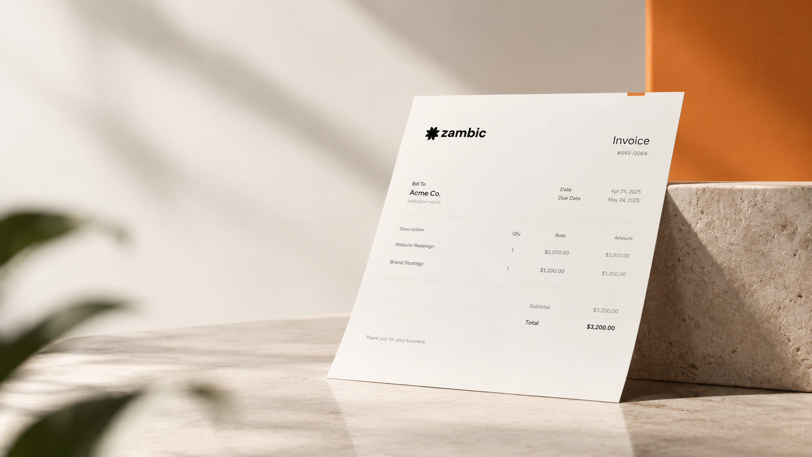
01 — Platform Interface
Clean desktop layout with balanced typographic hierarchy and prominent calls to action.
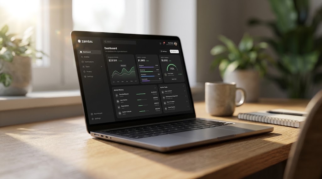
02 — Design Tokens & Component Ecosystem
Modular UI components, consistent spacing tokens, and purposeful typographic hierarchy.
Attention to digital craft.
Carefully calibrated UI elements that deliver a smooth, premium feel.
Typographic Contrast
High-contrast display sizing paired with legible body scales.
Subtle Depth
Restrained border treatments and micro-elevations rather than heavy shadows.
Action Hierarchy
Clear primary and secondary button distinctions that direct user attention.
A more cohesive digital system built to support future growth.
The project delivered a unified brand identity and a stable web foundation designed to support the business as it continues to evolve.
Intentionality at every touchpoint.
From identity to interface, every decision was made to ensure the brand communicates clearly, credibly, and consistently.